In this episode of EarHustle411’s “You Be the Judge” we came across a story where the logo of an organization has sparked some controversy. Take a look at the logo and read about the concept and share your thoughts about it.
Are people being overly sensitive about it or do they have a legitimate gripe?
The names of companies and their products bear much weight to the public and therefore must be chosen wisely. But lately, in an attempt to implement successful market strategies, companies have chosen names and advertisement images that appear to be embedded with racist overtones and have ended up offending a lot of people instead of positively attracting them.
Recently, a public relations firm specializing in food and drink named itself Strange Fruit PR. The firm, launched by two white women, said that although they were aware that “Strange Fruit” is the title of a song by Billie Holiday that talks about the lynching of Black people, they were oblivious to the fact that this would upset anyone.
“We, of course, Googled to ensure that it was not taken elsewhere and found the Billie Holiday song online,” Mary Mickel, one of the Strange Fruit PR co-creators, told Statesman. “Thinking it would have nothing to do with our firm, and since it was written in 1939 it wouldn’t be top of mind in the public consciousness. We now know we were naïve to think that, and should have known better.”
The women changed the company’s name and even issued an apology.
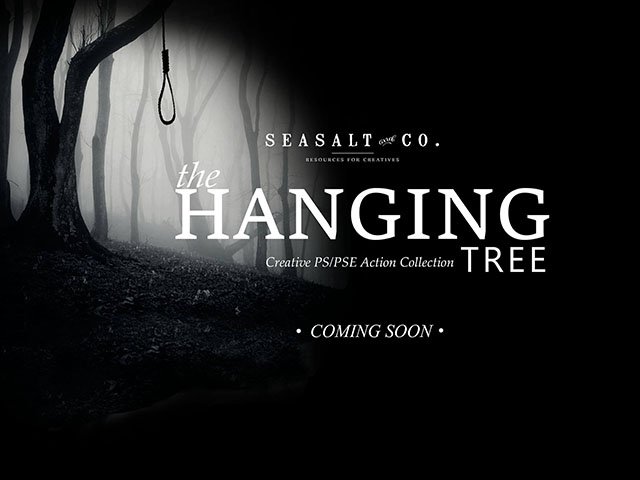
Today, another public relations company, Seasalt & Co, decided to use the name “The Hanging Tree” in its new graphic design set and even went as far as to use a noose hanging from a tree to advertise its set of thematic photographic images.
The company posted on Facebook that the image was intended to represent the injustices in the industry.
“The image and name represent that we refuse to be hated against and having the industry mobs joining forces to bully and ridicule artist,” the post read.
To many others, however, the image means so much than that. Nooses were tied onto trees and used to hang and choke Black Americans to death during slavery and up into the 1960s.
In a conversation on Twitter with jewellery and graphic designer Rachel Stewart, who fiercely confronted Seasalt & Co about the offensive image, the company defended itself, saying that they were taking a stand and that the image represents the injustices in their industry and world.
Stewart asserted that it was very inappropriate for the company to use the noose and that it was absolutely unnecessary.
“The noose isn’t necessary and I am a photographer and graphic designer you don’t need a noose to convey a gritty image, you are being extremely insensitive and flippant to use this image to advertise with, I find it horrible’ Seasalt & Co was so much on the defensive trying to justify the image but the image was more harm than good,” Stewart wrote in a tweet.
The general consensus is that the ad campaign has got to go. But Seasalt & Co is much more unapologetic about their questionable idea than the public relations firm formerly known as Strange Fruit. When asked to change their image, the company refused and ended their social media discussion by saying that Seasalt & Co was going to take legal action against anyone who had a problem with the ad.
Source: Financial Juneteenth


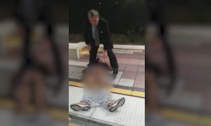


![[Video] Chicago Police Officers Caught On Video Telling Two Black Men "We Kill Mother F**kers"](https://earhustle411.com/wp-content/uploads/2018/07/evil-cop-3-300x180.jpg)
![[Video] Chicago Police Officers Caught On Video Telling Two Black Men "We Kill Mother F**kers"](https://earhustle411.com/wp-content/uploads/2018/07/evil-cop-3-80x80.jpg)


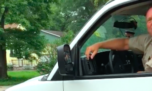
![[Video] White Woman Calls The Cops On Black Real Estate Investor, Cops Threaten To Arrest Her For Harassing Him](https://earhustle411.com/wp-content/uploads/2018/05/nosy-neighbor-300x180.png)
![[Video] White Woman Calls The Cops On Black Real Estate Investor, Cops Threaten To Arrest Her For Harassing Him](https://earhustle411.com/wp-content/uploads/2018/05/nosy-neighbor-80x80.png)


![White Scientist Says The Black Community Is Being Targeted By The Medical System, They Are Deliberatly Being Poisoned [Video]](https://earhustle411.com/wp-content/uploads/2016/05/mike-adams-300x180.jpg)
![White Scientist Says The Black Community Is Being Targeted By The Medical System, They Are Deliberatly Being Poisoned [Video]](https://earhustle411.com/wp-content/uploads/2016/05/mike-adams-80x80.jpg)


![Teenage Girl Shot In Her Stomach Three Times But Took Time To Post To Facebook [ Video]](https://earhustle411.com/wp-content/uploads/2016/02/Gangster-chick-300x180.jpg)
![Teenage Girl Shot In Her Stomach Three Times But Took Time To Post To Facebook [ Video]](https://earhustle411.com/wp-content/uploads/2016/02/Gangster-chick-80x80.jpg)